It’s back to school time again, meaning it’s also back to after school activities. Thing 1 is in chess club and takes piano lessons. Thing 2 wants to be a Girl Scout Daisy.
There’s also a bevy of after school sports to choose from, all run by organizations that at this age (3rd and K) are not our school system, but rather private organizations that come to schools throughout the area for things like soccer, field hockey, etc.
Problem #1: Heard of Mobile, Maybe?
Yesterday, while at the kitchen table, I checked the website for the Montgomery Sports Association on my iPhone. I wanted to find out which sports they’d be teaching at my children’s school. In 2010 their website looked like this:
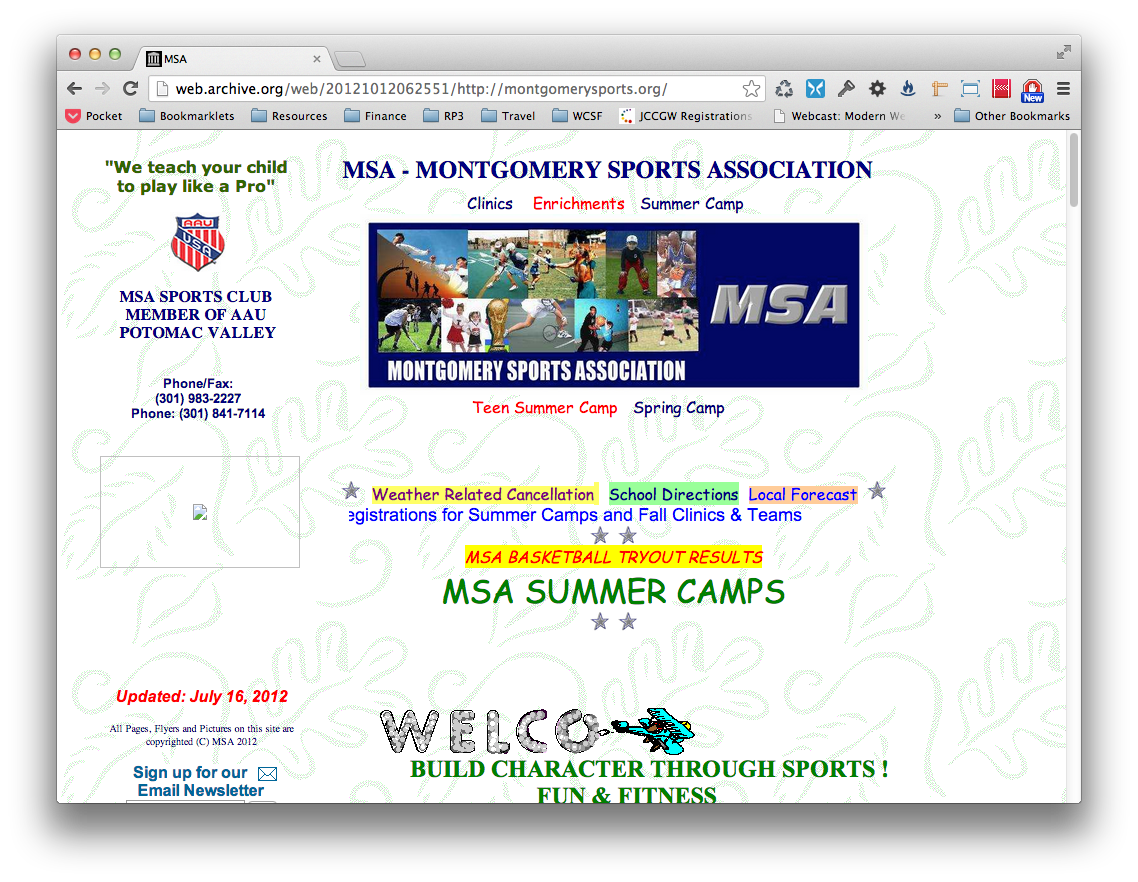
Picture the little plane moving left to right, revealing the word “Welcome,” marquees, and spinning stars. It was awesome.
They redid their site, so now it looks like this:
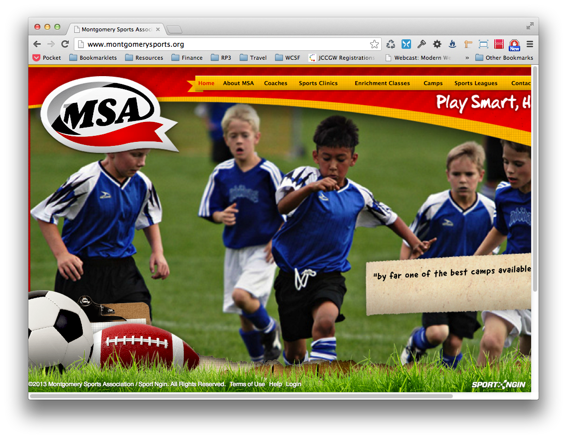
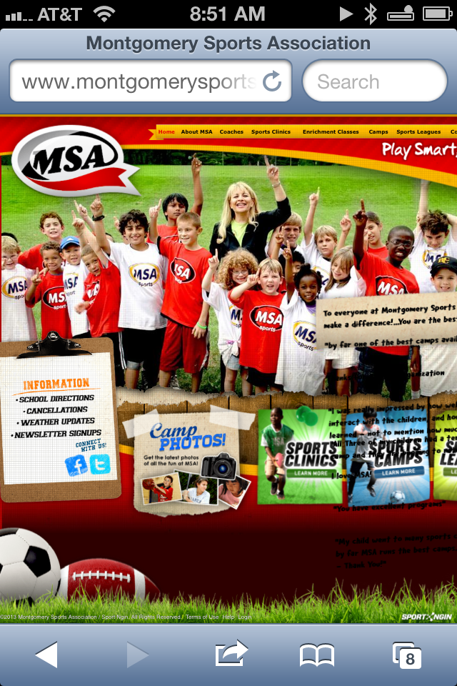
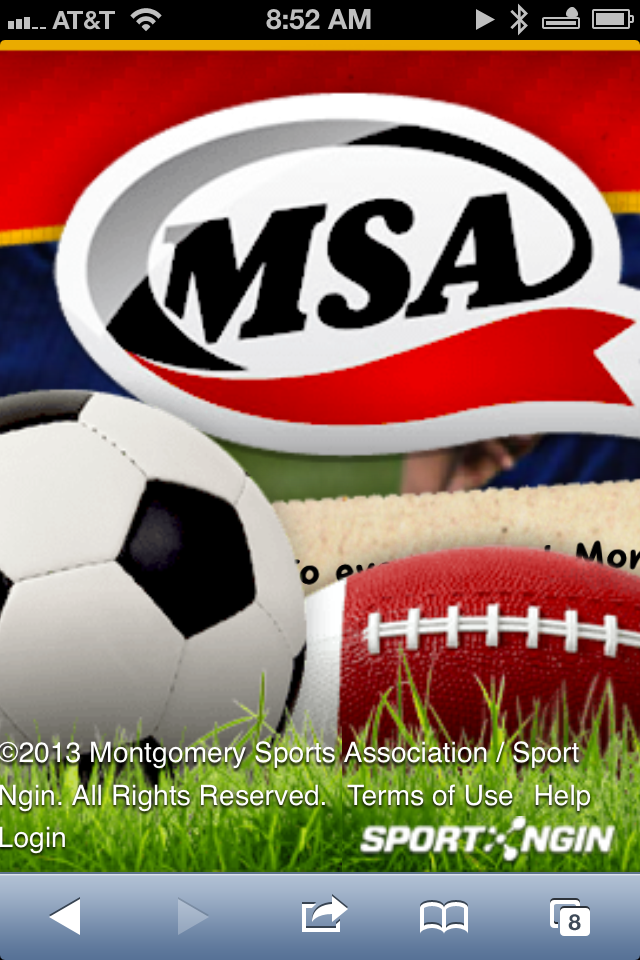
which looks much more spiffy, except that it’s not. Try going to their website with an iPhone (I dare you. It’s http://www.montgomerysports.org.) and you’ll find that it’s utterly, totally, completely unusable. In its default, zoomed-out state, the text in the navigation is far too small to read, let alone tap, and if you try and pinch-and-zoom in, the fixed-position logo and ball graphics actually scale up in size, blocking the entire page.
Has anyone in their organization ever tried to view their site on an iPhone? Have they even heard of iPhones?
As much as I’d love for every website to be responsive, I realize that isn’t going to happen any time soon. But if you’re going to build a site this far into the 21st century, you can at least make it so your site isn’t going to completely, utterly BREAK on mobile!
When I tried to view the site yesterday, at my kitchen table, I could’ve easily used my laptop (except that it was in a different room) or I could’ve pulled out my iPad (except that it was charging). But why should a website dictate which device I use to view it on?
The answer is, it shouldn’t. All I wanted to do was to find out which sports would be offered at my children’s school, and that’s when I ran into problem #2.
Problem #2: Give Me What I Want
So finally I go onto my laptop in order to find the information I’m looking for. As one might expect, there’s a whole list of sports listed under the “Sports Clinic” section of the main nav, offering choices from basketball to Zumba (srsly?). But what if I only am interested in their clinics being offered at my kids’ school (which I am)? Is there any way to easily search for sports by location?
Of course there’s not! Even entering their school name into their search field returns zero results. Instead, I have to go into each individual sport, scroll down through the fixed-position grass (I see that skeuomorphism is alive and well here!), and go though the list of locations for that sport to see if it’s offered at the school I want. That’s fun.
Problem #3: Engage
Let’s move a little beyond the website into the broader world of social media engagement. MSA proudly displays links to their Facebook and Twitter pages on their home page, which are decidedly lacking in content. Their most recent Facebook entry is how excited they are that the best summer camp in Montgomery County begins tomorrow. o_O Yes, it’s from June. So there’s been nothing to talk about since then?
At least their summertime Facebook posting is a little more current than their last tweet, dated October 23! Even if they had just regurgitated their Facebook posts to their Twitter feed (as Rockville Town Square does), at least that would’ve been a little better. No updates on rain cancellations? No teasers about upcoming clinics in all that time? Definitely missed opportunities in marketing going on here.
It Doesn’t Have to Be This Way
None of the problems listed here are insurmountable, and in fact, wouldn’t take much effort to fix. If you aren’t going to go responsive, then fine (well, not fine, but whatever), but at the very least make sure your website works on mobile. Even if it is just via pinch-and-zoom, which sucks, but is better than giant logos that block the entire page.
It’s a pretty safe assumption that their listings of courses are in some sort of database, so why not just offer a page where programs are listed by location, rather than limit your navigation to programs-by-sport only?
Lastly, if you’re going to bother to have a Facebook and Twitter presence, then bother to keep it updated. Cross-post if you have to, but at least make it worth our while to follow you.